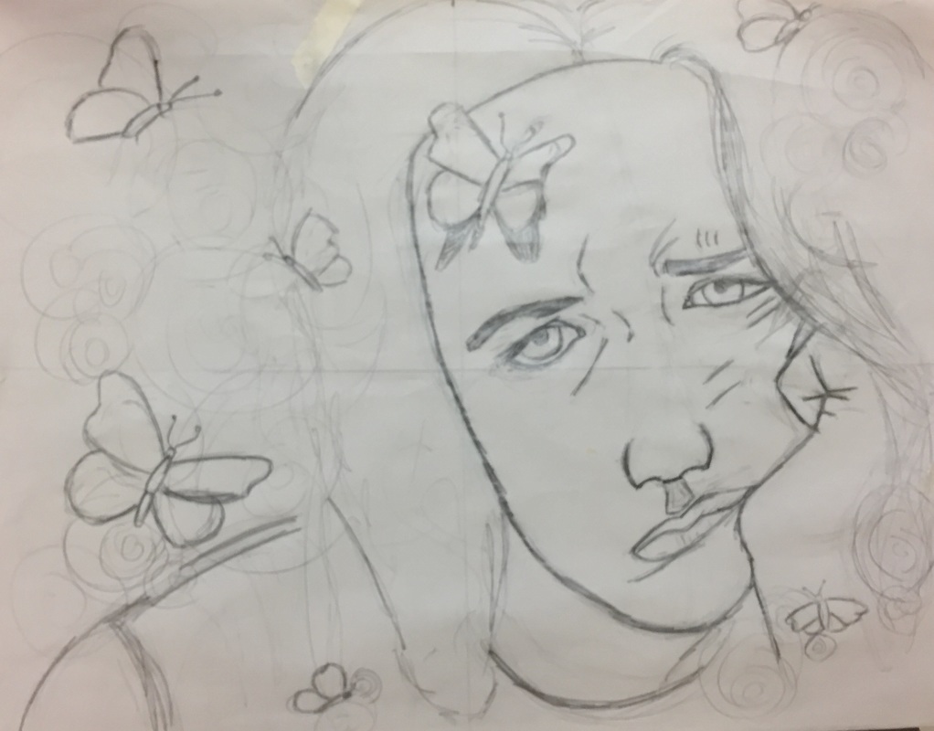
Reference Picture and Sketches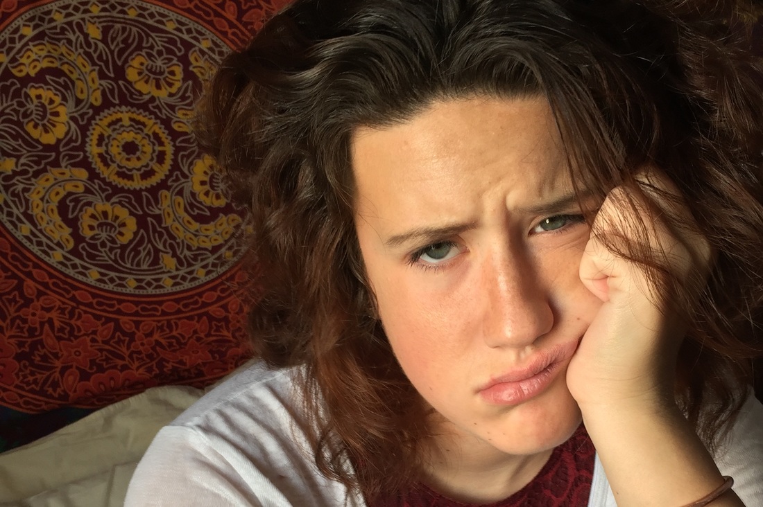
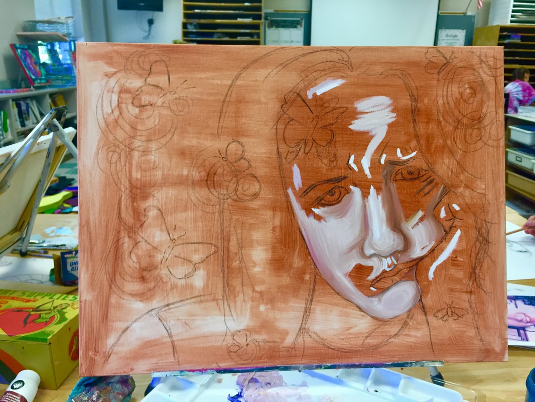
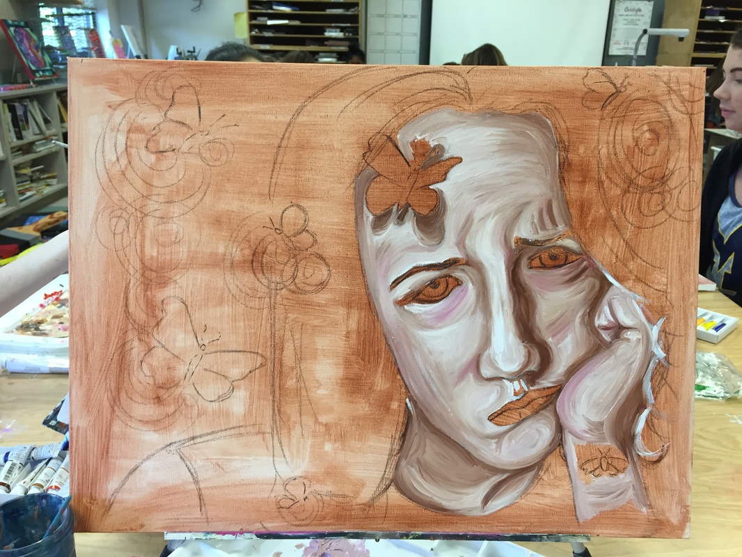
In Progress Pictures
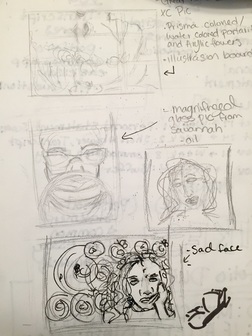
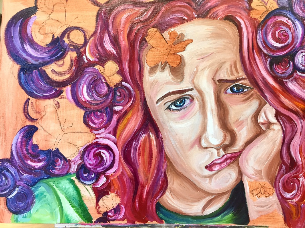
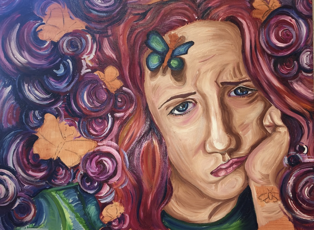
Final Piece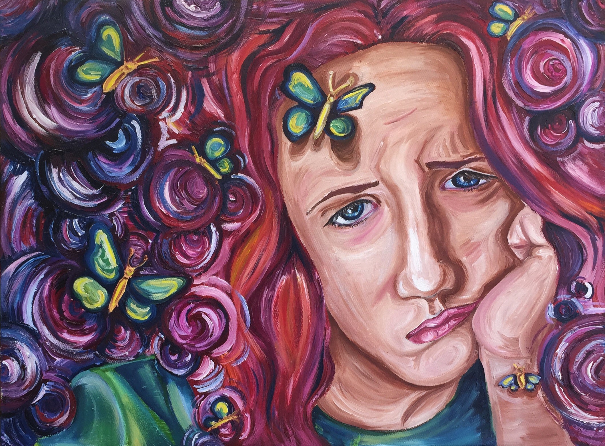 I find it funny how the project I dreaded most turned out to be my favorite. Last year I really lacked confidence in my ability to create and I held back in a lot of ways, always picking subject matter that was "safe" and I knew I could draw with out question. I believe lately I have started to lose that lack of confidence thanks to my summer adventures in Savannah, art 4, and the support/help I get in my independent study. This piece is extremely important to me because it was the cherry on top towards allowing me to believe I can create whatever I want (sorry to be all sappy). This is my second portrait ever, I even avoided them over the summer and I was so scared to start this piece. All I knew was that I wanted to create an expressive piece and from there I began taking pictures. I was even skeptical about painting this picture due to self doubt, but I decided to take the jump anyway and it was probably the best choice I could have made.
On a technical level, the piece is well executed. My face looks like my face, the color harmony flows nicely, I created nice texture and still managed to incorporate a very stylistic feel without over doing it. I first drew the piece on newsprint and then traced it over to the canvas, this technique reduced any stress I had because it allowed me to make mistakes until I got it right. I believe my proportions are correct, I am a little skeptical about the neck and forehead, but for the most part everything looks good. My goal in the beginning of the piece was to use more warm colors than cool, I still incorporated warm colors, but decided to great more of a gradient in the hair. The sections closer to the face had more red and orange hues and as they got further away I added more blue and purple hues. I also carried out the light blue and green in the piece through the shirt, butterflies, and eyes. I enjoyed making the swirls because I didn't have to think that much and just took big globs of paint and worked it onto the canvas. Thus creating a nice texture as well. Ultimately, I am incredibly proud of this piece. I LOVE the juxtaposition between the distressed expression and bright, lively background. I plan to hopefully make more portraits in the future.
1 Comment
Reference Picture and Sketches
In Progress Pictures
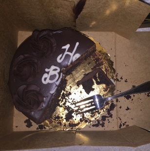
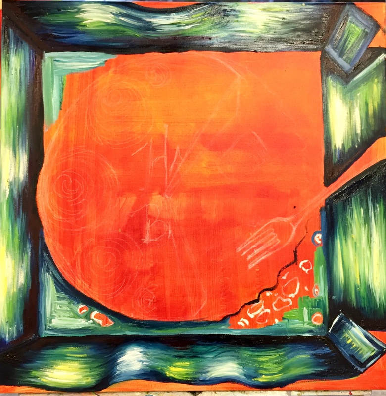
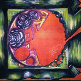
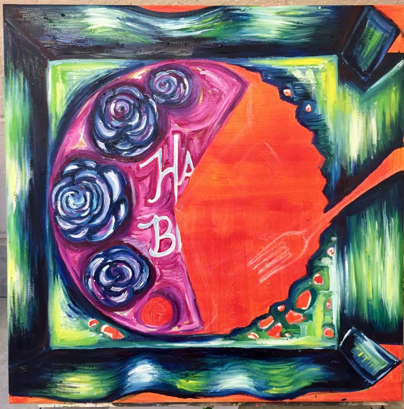 Final Piece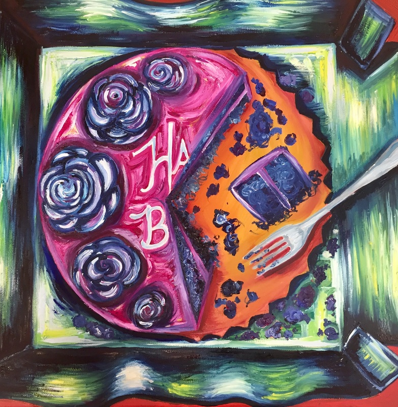 For this project I was asked to create an interior space piece and in the beginning I had no idea how hard finding a subject matter would be. It took me nearly a week to choose what I wanted to do, I contemplated a bathroom sink, an alley, a front porch and even the inside of a toilet. After I had wasted a lot of time, I finally settled on a picture of my moms birthday cake. I definitely didn't like settling and it felt like I was doing this piece just to appease the project (if that makes sense). Anyway I definitely believe my distain towards this piece comes from the subject matter.
Apart from the subject matter, I believe this piece was a good way to practice my painting skills. This piece forced me to color block a wide variety of colors, unlike the shoe piece where I only had a couple colors in a square, and ultimately helped me get more comfortable with the medium. I really love the designs I created on the cake and the texture I was able to create with big blobs of paint, and speaking of creating texture, this piece allowed me to get more comfortable in doing so. I think I was successful in creating a nice color scheme, however it wasn't the color scheme I pictured. Originally I wanted to create a more mono-chromatic piece, but I always seem to return to the same color palette. I believe the perspective of the cake is off, but that is because I drew the angles wrong and was too lazy/ stubborn to take the time and fix them. My shadows and highlights are also a little off because it was hard for me to figure out the light source in the picture. Regarding the box, I am frustrated on how it doesn't look like a box or really like the viewer is looking into it. I think the curvy sides are what throws off the eye and I regret doing that. Lastly, I think the piece is definitely not my favorite, but because of it I was able to get more comfortable with oil paints and can safely say, they are my favorite medium. I enjoyed the definitely simplicity of the piece and the texture I created. However, I hope I can one day sell this piece and get enough money from it to go shopping. 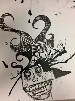 In honor of October, my mentee and I and did some Ink monsters. We learned about an artist who splatter ink onto paper and created a monster so we did the same! My Ink splatter did not turn out quite how I planned and I didn't really know what to turn it into. I basically just started drawing super fast without thinking and it turned into this creepy looking guy. I don't necessarily know how I feel about my piece, but it was fun to make.
Reference Picture and Sketches
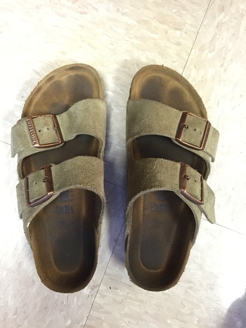
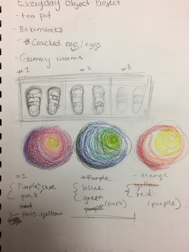
In Progress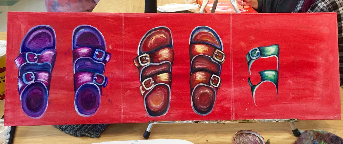 At this point in the project my opinion of oil paints had changed greatly since the apples, I had learned how to have better control of the medium. I was able to apply the paint without over blending and. as a result, could create nice contrast. Final Piece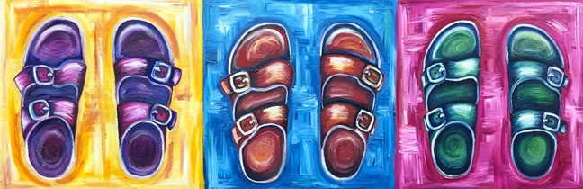 For this project we had to create an oil painting of an everyday object and at first all I could think of was things that represented a still life and the idea of that was incredibly boring to me. I also struggled to think of an object that sparked my interest or represented me as an artist. After lots of mediocre ideas, I finally settled on my Birkenstocks.The idea of the long canvas and pop art feel appealed to me because it allowed me to address the prompt while still being original.
On a technical aspect, this project really made me fall in love with oils (or at least appreciate them) because the paints allowed me a achieve a rich color, create smooth value transitions, and achieve texture throughout my pieces. I was able to plan and section out colors and then over time blend them together. I also enjoyed taking large clumps of paint and strategically placing them on the canvas after the under layers of paint had dried. I did however struggle greatly on the red shoes; the underpainting was red and the red oil paint looked brown before the background was added. As a result I kept over blending colors and applying to much paint, forcing me to scrape the shoe and start over. Ultimately, this is one of my favorite pieces ever. I enjoyed working with oils and I like how it literally forced me to plan my colors, which is something I rarely do. By planning my color scheme my color harmony worked nicely with the shoes being order cool, warm, cool and the backgrounds the opposite. In the future I plan to work with oils and continue improving my skills. |
AuthorWrite something about yourself. No need to be fancy, just an overview. Archives
January 2017
Categories |
 RSS Feed
