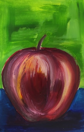
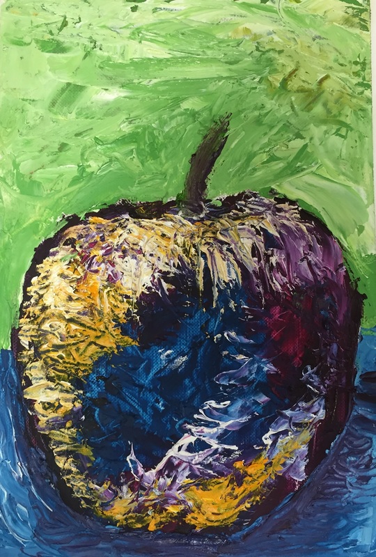
For my first time using oils, I was definitely not a fan. I kept over blending or trying to lay colors down on top of each other like it was acrylic paint and I learned very fast that you can not do that. For the palette knife piece, I also started out too fast and went to dark. In the future I plan on planning out color schemes and trying a more structured approach to the painting.
0 Comments
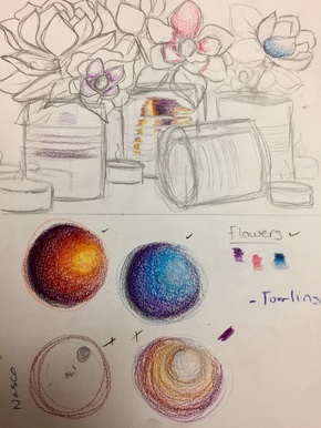
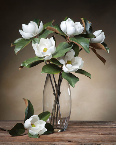
Reference Pictures and Sketches
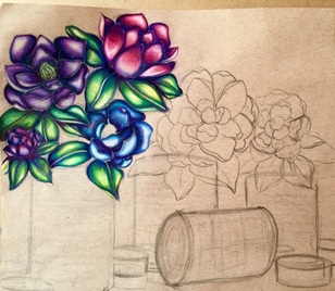
 In Progress Pictures
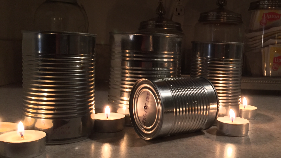
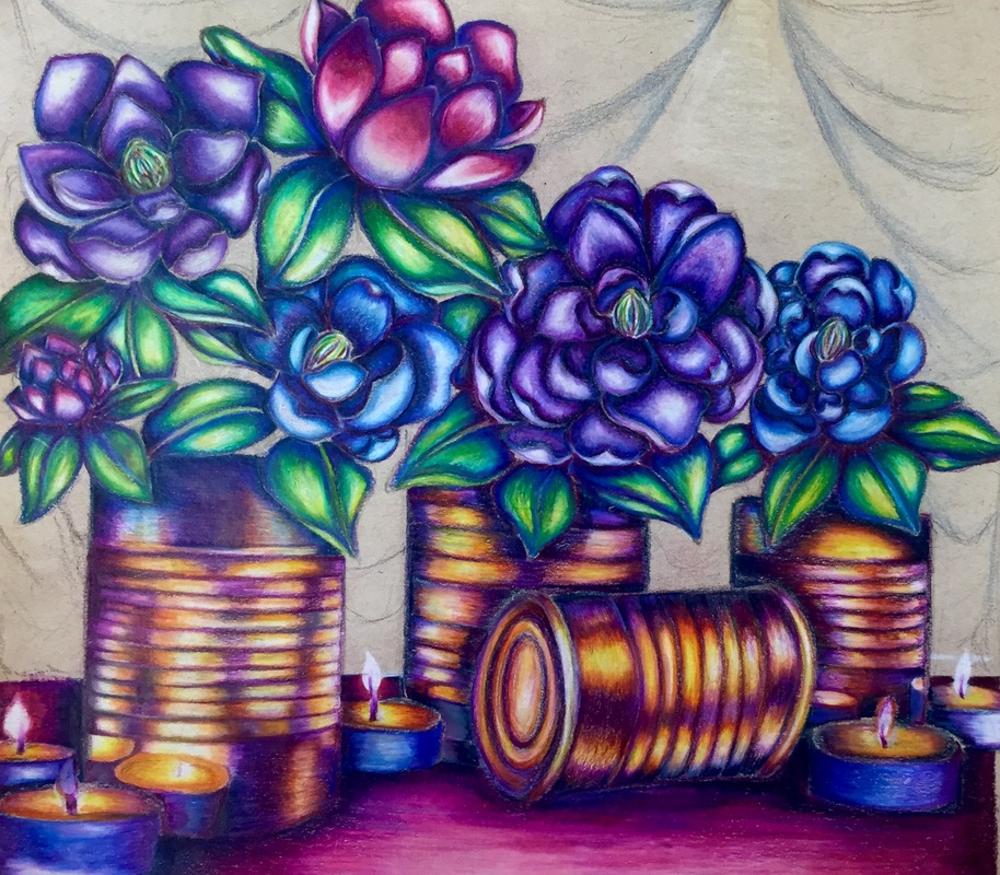
At this point in the project I was very satisfied with the outcome of my piece. I was really proud of how I began to push color boundaries on the cans and flowers. I believe my color scheme worked nicely and my values were strong. I was also successful in achieving the reflection of the tea lights onto the cans. Final Piece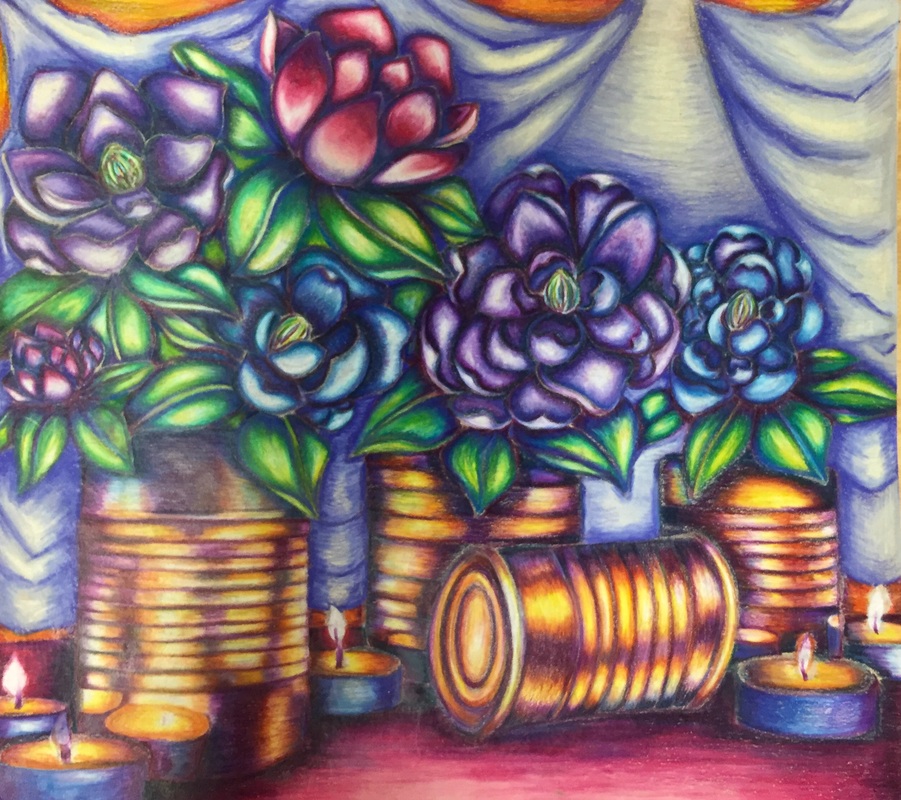 When first introduced to the reflective project, I honestly had no idea what to create. The first thing I think about when I am asked to "reflect" on a major quality about myself is art, but I did not want to do that. I wanted my piece to reflect me in the most subtle way possible. Literally the reflection aspect of the piece is the tea lights against the tin cans, on a more metaphorical level, the magnolia flowers and the tea lights reflect me. My grandparents plant a tree for every child and grandchild born into my family and mine was the magnolia tree. The flowers remind me of my childhood because I learned in the most frustrating way, magnolia trees take FOREVER to get flowers and when my tree finally bloomed it was the most exciting thing ever at the time (my grandma has a framed picture of me in 1st grade next to the first bloom). The tea lights also remind me of home because my mom has a billion of them all over the house.
As always, I enjoyed working with the Prismacolored Pencils. I really appreciated how easily I can blend a wide variety of colors and still have them all complement each other nicely. The strong contrast between the complementary colors (purple and orange) carried out through the piece creates a nice color scheme because they complement each other. I used a yellow prisma to create a highlight in the leaves and I believe it really gave them depth. I also utilized a dark purple and blue to create cast shadows and the darker values, allowing some flowers to appear in front of others, the cans to appear in front of the fabric, ect. Regarding color, my biggest challenge was not creating mud. With the purple and orange directly next to each other in the tin cans it was incredibly challenging to try and blend the colors with out making brown. If I could change anything about this piece, it would be the background. I always struggle with backgrounds because I am usually burnt out by the time I get to them and do them just to get the drawing done with. I like my fabric, I just wish I had found a reference picture and drawn it a little less uniformed. I also wanted to make the fabric gray, with only little hints of purple to accident the piece. Unfortunately, the purple was more overpowering than I anticipated and I believe the background now takes away from the flowers. Overall, I am satisfied with the piece, but acknowledge my mistakes and know what to not do in future pieces. |
AuthorWrite something about yourself. No need to be fancy, just an overview. Archives
January 2017
Categories |
 RSS Feed
